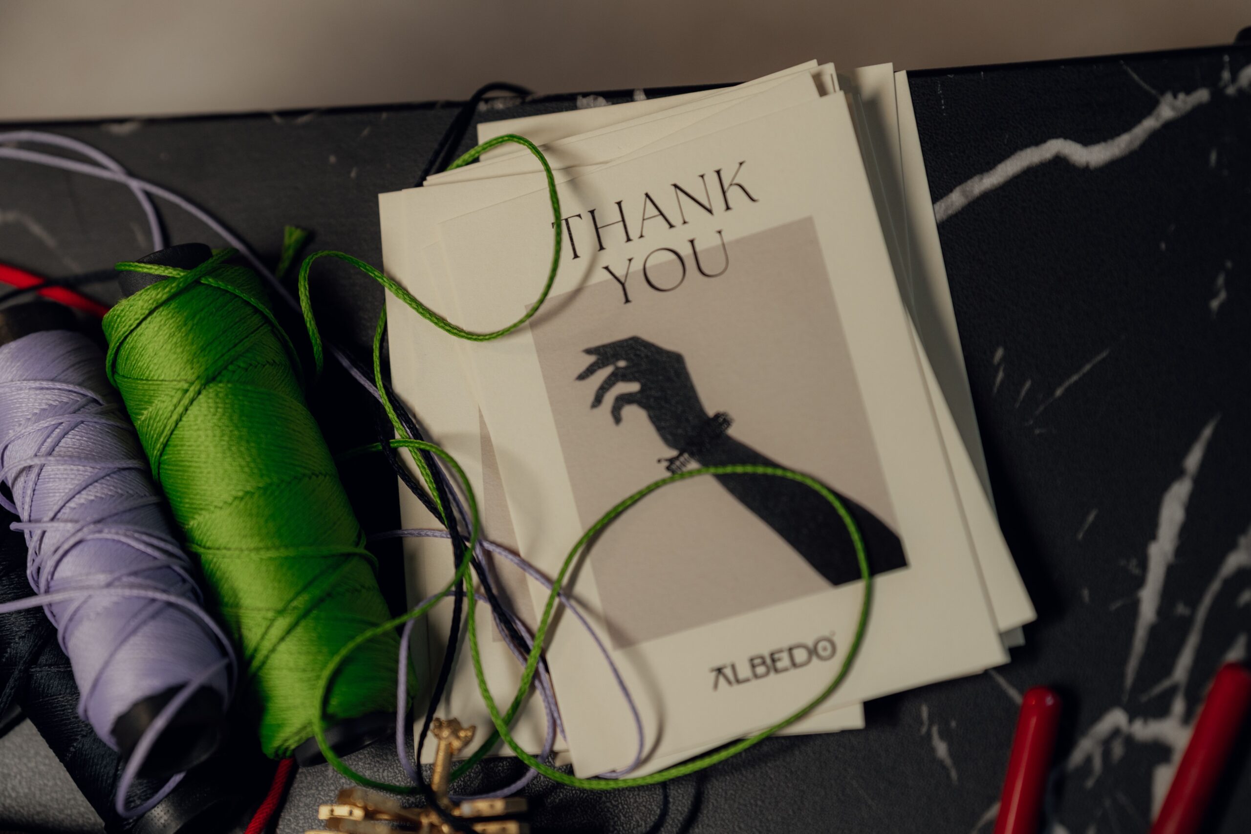
A thank-you card does not need expensive paper, elaborate tools, or the handwriting of a calligrapher. It needs one clear feeling and a detail that could not have come from a generic box of cards.
That detail might be a hand-cut sprig for the friend who brought soup, a tiny paper coil for someone whose gift was delightfully whimsical, or a pop-up flower for the person who helped you through a difficult week. The best handmade cards are not miniature art exhibitions. They are small acts of attention.
If you want a quick visual starting point before making your own, browse Adobe Express’s thank you card design ideas for layout inspiration, then put the screen away and let the finished piece become yours.

Begin with the memory, not the materials
Before choosing a color palette, finish this sentence: “I am thanking you for…” Be specific. “The birthday present” is a starting point; “the blue mug that made my first week in the new apartment feel less lonely” gives you a visual direction.
Translate that memory into one motif. A leaf can suggest growth, a window can suggest welcome, and a constellation can suggest someone who helped you find your way. Limit yourself to one main image and one supporting texture. This restraint matters because the message should remain legible when the card is opened.
The Robert C. Williams Museum of Papermaking describes paper craft through actions such as cutting, folding, rolling, weaving, and layering. Those are more useful categories than a shopping list: they give you a small vocabulary from which to build a card.
Technique one: make the message appear from a cut
Paper cutting creates contrast through absence. A window, arch, branch, or row of lettering can be cut from the front panel so that a second color shows through beneath it.
- Fold and score the card base before cutting the decorative panel.
- Sketch the design on tracing paper or the back of the sheet, keeping bridges between separate shapes.
- Cut the largest openings first, then refine corners and small details.
- Mount the panel over a contrasting sheet with thin foam tape or narrow strips of double-sided adhesive.
For a beginner-friendly version, cut a simple botanical silhouette rather than a sentence. Handwritten words can sit inside the card, where a slight wobble feels intimate instead of imperfect. Use a craft knife only on a proper cutting mat, and keep the design comfortably inside the fold so it does not weaken the spine.
Technique two: turn a line into a little sculpture
Quilling is made from narrow strips of paper rolled into coils and pinched into shapes such as teardrops, leaves, and hearts. It looks intricate, but the first useful design can be made with a toothpick, glue, cardstock, and a few strips cut from ordinary paper.
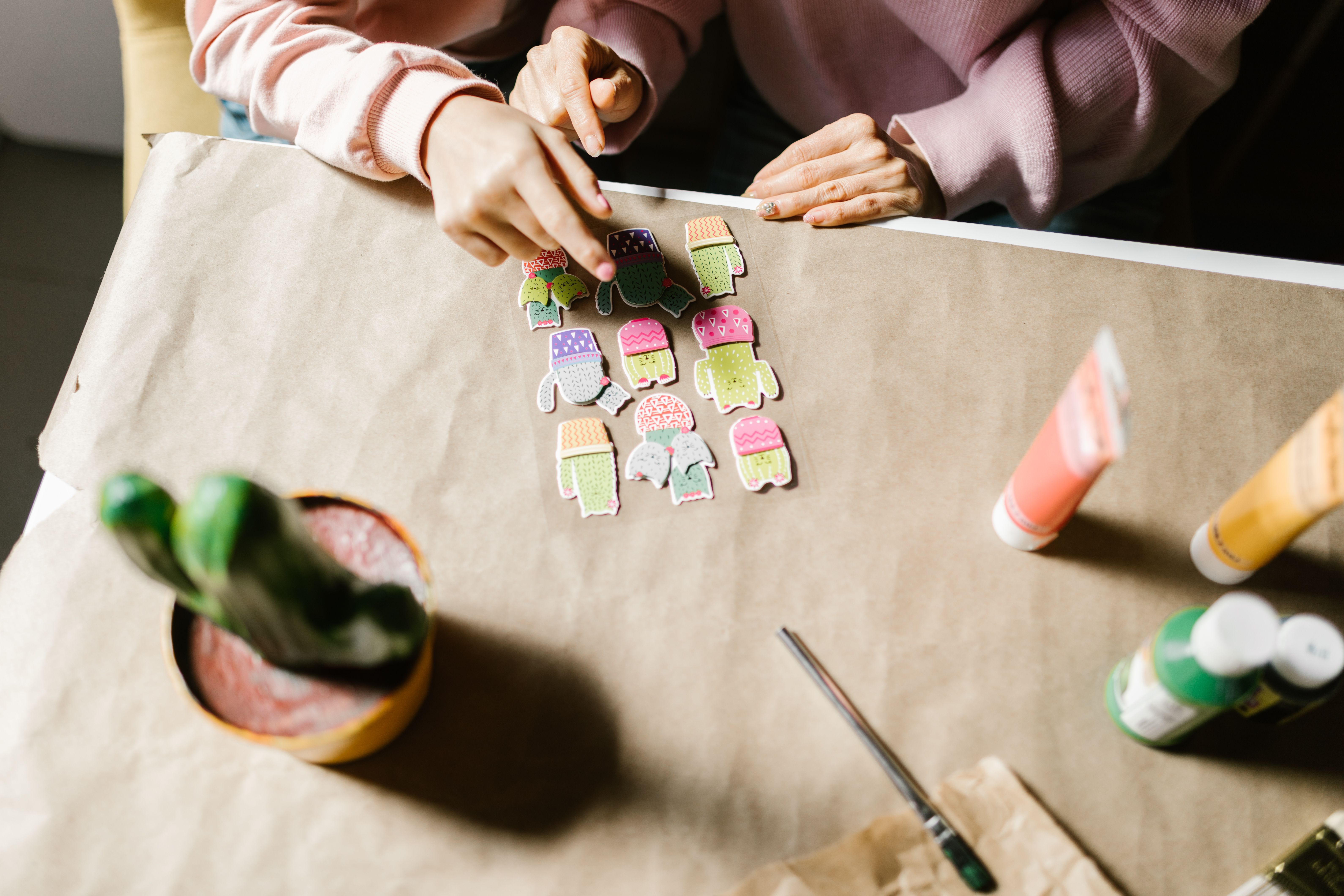
The Anchorage Museum’s quilling guide recommends creating the shapes first, laying out the design, and only then gluing the pieces to cardstock. That sequence prevents the most common quilling mistake: committing a beautiful coil to the wrong place.
Try a small wreath around the words “thank you.” Make loose coils for the center, pinch a few into leaves, and vary the direction of the pieces rather than making a perfectly symmetrical ring. A little asymmetry keeps the card from looking manufactured.
My preference is to use quilling as punctuation, not wallpaper. Three leaves at one corner or a single raised heart beside a name can have more warmth than a whole page of coils. Keep glue minimal and apply it with a toothpick; visible glue turns delicate paper into a glossy accident.
Technique three: layer color like a quiet collage
Layering is the most forgiving technique for a card that needs to look polished without demanding perfect cutting. Choose three papers: a calm background, a mid-tone shape, and one small accent. The papers can be solid, recycled, torn, or patterned, but they should differ in value so the layers do not disappear into one another.
If you want to see how layering, overlapping shapes, and contrasting paper textures can create depth in a collage, The Metropolitan Museum of Art features several useful examples.
Cut a broad shape for the middle layer, such as a vase, envelope, sun, or pocket. Add one smaller shape on top and leave the bottom layer visible around the edges. Before adhesive enters the picture, move the pieces around and take a quick phone photo of the arrangement you like.
For more depth, use thicker adhesive behind the focal layer and flat adhesive behind the background layer. The slight shadow makes the design tactile when the card is held, while the writing surface stays smooth enough for a personal note.
Technique four: give thanks a small surprise
A simple pop-up can turn an ordinary opening into a moment of discovery. A V-fold or box fold creates a platform inside the card; attach a flower, a stack of books, a tiny teacup, or a word such as “YOU” to that platform.
The University of Warwick’s paper-engineering resources explain why scoring, parallel cuts, and accurate folds matter: the card is not merely being decorated, it is directing movement through paper. Make a test mechanism from scrap first. If the card does not close flat, shorten the pop-up or move it farther from the fold rather than forcing the cover shut.
For a reliable first attempt, make two short, parallel cuts near the center fold, push the resulting tab inward, and crease it firmly. Attach a lightweight shape to the tab. Keep the pop-up narrow enough to fit inside the envelope and avoid heavy embellishments that pull the structure forward.
Lettering is part of the craft
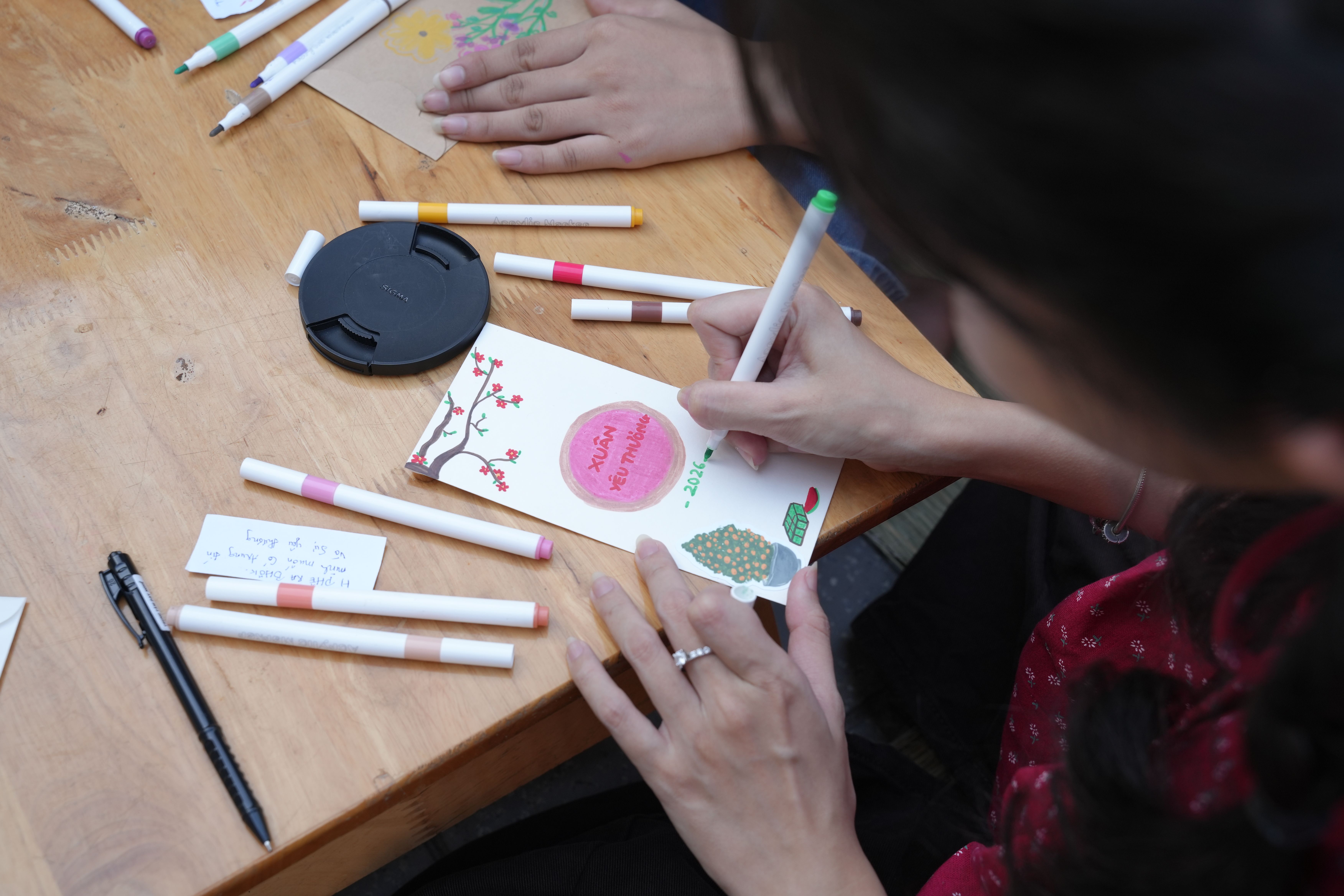
Decorative lettering works best when it remains readable. Write the message on scrap paper first, then decide whether it belongs on the cover, inside the card, or on a separate paper band. A strong short cover line might be “You made a difference” or “A very big thank you,” followed by the story inside.
Use one expressive word and keep the rest plain. Brush pens, colored pencils, and even a fine black marker can work; the important choice is contrast. If the card already has raised coils or layered shapes, quiet lettering gives the eye somewhere to rest.
Make the finished card feel like a gift
Test the card in its envelope before adding the final embellishment. Check that it folds without catching, that the message is visible at the intended moment, and that no raised edge is likely to snag. If you are mailing a dimensional design, add a lightweight piece of cardboard for support and check with the postal service whether its thickness changes the postage.

Then write the note before you talk yourself out of the specificity. Name what the person did, describe how it affected you, and end with a warm line about seeing them again. The craft catches the eye; the sentence is what the recipient keeps.
That is the quiet art of gratitude: not making the most complicated card, but making a small object that proves you noticed. A cut edge, a folded tab, or a paper coil becomes memorable when it points back to a real person and a real moment.
Sources and further inspiration
- The Craft of Paper from the Robert C. Williams Museum of Papermaking at Georgia Tech.
- COLAB Paper Quilling from the Anchorage Museum.
- Paper Engineering from the University of Warwick.